
Table of Contents
- How Do You Choose the Right Colors for Home Interiors?
- Why Is Color Important in Interior Design?
- Understanding Color Psychology in Interior Design
- Best Interior Colors for Different Rooms
- Common Home Interior Color Mistakes to Avoid
- Choosing Interior Colors for Ahmedabad Homes
- When Should You Hire an Interior Designer for Color Selection?
- How InVisual Approaches Home Interior Colors
- FAQs
- Final Thoughts: Your Home Colors Should Reflect More Than a Trend
Choosing furniture, flooring, lighting, and décor is important when designing a home, but one element can completely change how every other design decision looks: color.
The right interior color palette can make a small room feel more spacious, turn a bedroom into a peaceful retreat, make a living room more welcoming, and bring visual harmony across your entire home. The wrong color combination, on the other hand, can make even expensive furniture and premium finishes feel disconnected.
That is why choosing the right colors for home interior design should never be treated as an afterthought.
At InVisual Interior Designer Ahmedabad, color selection is considered part of the overall design strategy. Rather than simply choosing a trending wall shade, the palette should complement the architecture, lighting, furniture, materials, room size, and most importantly, the homeowner’s personality and lifestyle.
If you are designing a new home, renovating an apartment, or simply wondering which color combination will work best for your interiors, this guide will help you make a more confident decision.
How Do You Choose the Right Colors for Home Interiors?
To choose the right colors for your home interior design, consider:
- Room size and layout
- Amount of natural light
- Artificial lighting
- Existing flooring and furniture
- Mood you want to create
- Interior design style
- Warm and cool undertones
- Ahmedabad’s climate and sunlight
- How colors flow between connected rooms
- Your personal preferences rather than trends alone
A successful home color palette usually combines a dominant neutral shade, a complementary secondary color, and carefully selected accent colors.
Why Is Color Important in Interior Design?
Color is one of the most powerful elements of interior design because it changes how we visually and emotionally experience a room.
It can influence:
- How large or small a room feels
- Whether a space feels warm or cool
- How bright the room appears
- Whether an interior feels relaxing or energetic
- How furniture and décor stand out
- The visual connection between different rooms
- The overall personality of a home
For example, lighter colors often help compact rooms feel more open, while deeper shades can create a more intimate and dramatic atmosphere.
InVisual’s residential design approach already focuses on balancing proportions, lighting, textures, functionality, and personal style rather than treating individual elements separately. The firm’s home interior services also specifically recognize that color defines mood and identity.
This is why professional interior design goes beyond asking:
“Which color looks good?”
The better question is:
“Which color works best for this particular space?”
Understanding Color Psychology in Interior Design
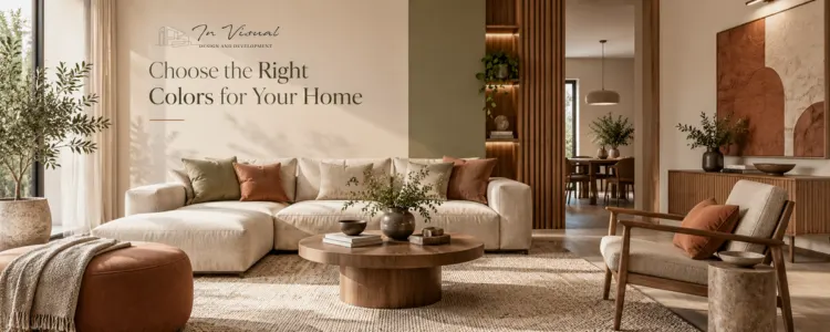
Color psychology in interior design refers to the way different colors can influence the mood, atmosphere, and overall perception of a space.
Although personal associations with colors vary, certain color families are commonly used to create particular design experiences.
White and Off-White
White, ivory, cream, and off-white shades can create interiors that feel:
- Clean
- Bright
- Open
- Minimal
- Calm
They are especially useful as a base color because they work well with wood, stone, metal, artwork, and stronger accent shades.
However, the undertone matters. A warm creamy white can feel very different from a cool bluish white.
Beige, Greige, Taupe and Warm Neutrals
Warm neutrals remain extremely versatile for modern homes.
Colors such as:
- Beige
- Sand
- Greige
- Taupe
- Khaki
- Warm grey
can create an elegant and timeless foundation.
Current 2026 color direction also continues to favor warm, nature-inspired neutrals. Sherwin-Williams selected Universal Khaki as its 2026 Color of the Year, describing the broader direction around timeless functionality and nature-inspired warmth.
InVisual Interior Designer has also identified warm beige, greige, creamy off-white, taupe, sand tones, muted olive, and clay shades as relevant to modern Ahmedabad interiors.
Blue
Blue is often associated with:
- Calmness
- Freshness
- Rest
- Sophistication
Soft blues may work well in bedrooms, study areas, and quiet spaces, while deeper navy shades can be used selectively for dramatic accents.
Green
Green brings a strong connection to nature.
Muted olive, sage, moss, and earthy greens can help create homes that feel:
- Relaxed
- Natural
- Balanced
- Contemporary
Green also pairs beautifully with wood, beige, cream, natural stone, and warm metallic finishes.
Brown and Earthy Tones
Brown, clay, terracotta, tan, and warm earth tones can make interiors feel grounded and inviting.
These colors work particularly well in:
- Living rooms
- Dining spaces
- Bedrooms
- Farmhouses
- Nature-inspired interiors
Yellow
Yellow can introduce energy, optimism, and warmth.
Instead of using intense yellow throughout a large space, softer mustard, ochre, or muted yellow accents can work well in cushions, artwork, upholstery, décor, or feature elements.
Red
Red is visually powerful and energetic.
It can work as an accent in social spaces such as dining areas, but large amounts of intense red may overpower compact residential interiors.
Deeper wine, burgundy, rust, and terracotta tones often offer a more sophisticated alternative.
1. Start With the Mood You Want to Create
Before selecting paint shades, ask yourself:
How should this room feel?
That one question can eliminate many unsuitable colors.
For example:
For a Calm Bedroom
Consider:
- Soft beige
- Warm white
- Sage
- Muted blue
- Greige
- Taupe
For an Inviting Living Room
Consider:
- Warm beige
- Sand
- Cream
- Olive
- Terracotta accents
- Warm grey
For an Energetic Social Space
Consider stronger accent colors such as:
- Rust
- Mustard
- Deep green
- Burnt orange
- Burgundy
Instead of choosing a color because it looks attractive on a small sample, think about the emotional experience you want from the complete room.
2. Consider the Size of the Room
Room dimensions should influence your interior color choice.
Colors for Small Rooms
For compact apartments or smaller rooms, lighter shades can help create a greater sense of visual openness.
Popular options include:
- Off-white
- Cream
- Light beige
- Soft greige
- Pale taupe
- Light muted pastels
InVisual Interior Designer uses soft neutrals, accent hues, and carefully chosen finishes to help apartment interiors feel visually more spacious and balanced.
However, this does not mean small rooms must always be white.
A carefully used deeper color can also create character when balanced with good lighting and lighter surrounding surfaces.
Colors for Large Rooms
Large rooms provide greater flexibility.
You can experiment with:
- Deeper wall colors
- Stronger contrast
- Dark wood finishes
- Statement walls
- Rich accent colors
- Layered palettes
The key is ensuring that the scale of the room can visually support the stronger shade.
3. Study the Natural Light Before Choosing Wall Colors
One of the biggest interior color mistakes homeowners make is selecting a paint shade without checking how it reacts to natural light.
The same wall color can look completely different:
- In the morning
- At noon
- During sunset
- Under artificial lighting
A color that appears warm in a showroom may appear cooler inside your home.
Before finalizing your interior paint colors:
- Apply samples on multiple walls.
- Observe them during different times of day.
- Check the colors with curtains open and closed.
- View them under your actual interior lights.
For Ahmedabad homes, daylight management is especially important because local interiors need to respond to strong sunlight, heat, and changing seasonal conditions. InVisual’s current design approach specifically considers sunlight, ventilation, and daylight when planning residential interiors.
4. Don’t Ignore Artificial Lighting
Your wall paint does not exist independently of your lighting.
Warm lighting can make certain colors appear:
- More golden
- Softer
- Warmer
- Richer
Cooler lighting can make the same color appear:
- Crisper
- Greyer
- Cooler
- Less saturated
That means lighting and color selection should be planned together.
Lighting is treated as an important part of room design. Its bedroom, living room, ceiling, dining room, foyer, and other residential design services consistently combine lighting, material, proportion, and aesthetics rather than considering each element separately.
5. Understand Warm Colors vs Cool Colors
Another easy way to narrow down your home interior color palette is to understand whether your room needs a warm or cool visual direction.
Warm Interior Colors
Examples include:
- Beige
- Cream
- Terracotta
- Rust
- Mustard
- Warm brown
- Peach
Warm colors generally make spaces feel cozy and inviting.
Cool Interior Colors
Examples include:
- Blue
- Cool grey
- Teal
- Certain greens
- Lavender
Cool colors can create a peaceful, fresh, or contemporary feeling.
Neither category is automatically better.
The right choice depends on the room, light, materials, and desired atmosphere.
6. Pay Attention to Color Undertones
Two beige colors can appear almost identical on a color card but completely different once applied to a room.
Why?
Because colors have undertones.
A neutral paint may have:
- Yellow undertones
- Pink undertones
- Green undertones
- Blue undertones
- Grey undertones
This becomes especially important when matching walls with:
- Marble
- Wooden flooring
- Tiles
- Furniture
- Kitchen countertops
- Curtains
- Upholstery
- Wardrobes
For example, a cool grey wall next to strongly warm-toned wood may create an unintended mismatch unless the combination has been deliberately designed.
Professional interior color consultation can help homeowners identify these subtle relationships before materials are purchased.
7. Use the 60-30-10 Color Rule
One useful starting framework for interior design color combinations is the 60-30-10 rule.
60% – Dominant Color
Usually applied to:
- Walls
- Large flooring areas
- Major surfaces
30% – Secondary Color
May appear in:
- Furniture
- Curtains
- Upholstery
- Cabinets
- Rugs
10% – Accent Color
Used through:
- Cushions
- Artwork
- Decorative objects
- Small furniture
- Feature elements
For example:
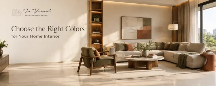
60% warm off-white + 30% natural wood and beige + 10% muted olive
can create a balanced contemporary interior.
The rule does not need to be mathematically exact. It is simply a useful way to avoid using too many competing colors.
8. Consider Existing Furniture and Materials
If you are renovating rather than designing a home from scratch, your existing materials should influence your new palette.
Before selecting wall colors, identify the dominant tones in:
- Flooring
- Sofa
- Wardrobes
- Kitchen cabinets
- Countertops
- Doors
- Curtains
- Wooden finishes
- Marble
- Tiles
Your wall paint should support these finishes rather than compete with them.
This is particularly important with expensive permanent elements such as flooring, marble, cabinetry, and countertops.
It is usually easier to change wall paint later than to replace an entire floor.
9. Choose Colors According to Your Interior Design Style
Your preferred interior style can also guide your color palette.
Modern Interior Design
Often uses:
- Greige
- Off-white
- Taupe
- Warm grey
- Beige
- Black accents
- Natural wood
Minimalist Interior Design
Often works with:
- White
- Cream
- Soft grey
- Beige
- Muted natural tones
Luxury Interior Design
May combine:
- Deep neutrals
- Rich browns
- Emerald green
- Burgundy
- Gold accents
- Marble tones
- Premium wood finishes
Nature-Inspired Interiors
Consider:
- Olive
- Sage
- Sand
- Clay
- Terracotta
- Brown
- Warm white
InVisual Interior Designer describes its residential design philosophy as balancing functionality, aesthetics, personality, and lifestyle, which makes the color palette part of a broader design identity rather than an isolated decorative choice.
Best Interior Colors for Different Rooms
Different rooms perform different functions. Their color schemes should reflect those functions.
Living Room Color Ideas
The living room often establishes the primary design language of the home.
Popular combinations include:
- Beige + cream + wood
- Greige + white + olive
- Warm white + taupe + brown
- Cream + terracotta accents
- Soft grey + wood + black accents
The goal should be creating a space that feels welcoming while connecting visually with nearby rooms.
Best Bedroom Colors
Bedrooms should generally support rest and comfort.
Consider:
- Warm beige
- Soft taupe
- Sage green
- Muted blue
- Cream
- Warm grey
- Dusty earthy shades
InVisual’s bedroom design philosophy emphasizes comfort, proportion, lighting, and texture to create restful and personalized spaces.
Best Kitchen Colors
Kitchen color selection should consider:
- Cabinets
- Countertops
- Backsplash
- Flooring
- Appliances
- Lighting
Popular modern kitchen palettes include:
- White + natural wood
- Beige + brown
- Greige + wood
- Cream + olive
- Charcoal accents + warm neutrals
Because kitchens contain several different materials, coordinating undertones becomes especially important.
Dining Room Color Ideas
Dining areas can support slightly warmer and richer colors.
Consider:
- Terracotta
- Olive
- Warm beige
- Rust accents
- Deep green
- Muted burgundy
- Warm neutral tones
Lighting can then create an inviting atmosphere during evening meals.
Home Office Colors
A home office should feel calm without becoming dull.
Suitable choices can include:
- Soft green
- Warm white
- Beige
- Muted blue
- Greige
- Light taupe
The right palette should support concentration while still fitting into the overall home interior.
Children’s Room Colors
A children’s room does not necessarily need intensely saturated colors on every wall.
A more flexible approach is to use:
- Neutral base walls
- Pastel shades
- Colorful furniture
- Artwork
- Bedding
- Playful décor
This allows the room to evolve as the child grows.
Should Every Room Have the Same Color?
No.
Every room does not need the same wall color.
However, there should usually be some visual relationship between connected spaces.
You can create continuity through:
- Repeating undertones
- Similar neutral backgrounds
- Related accent colors
- Consistent wood finishes
- Matching metal finishes
- A controlled overall palette
This creates what designers often call color flow.
A home should feel like one thoughtfully designed environment rather than several unrelated rooms.
Should You Follow Interior Color Trends?
Trends can provide inspiration, but they should not determine every design decision.
In 2026, warmer neutrals and earthy tones continue to play a major role in residential interiors. InVisual’s Ahmedabad trend coverage highlights warm beige, soft greige, creamy off-white, taupe, sand, muted olive, clay, terracotta, warm browns, and related earthy palettes.
But before adopting any trending color, ask:
- Will I still like this color after several years?
- Does it suit my home’s natural light?
- Does it match my flooring?
- Does it work with my furniture?
- Does it represent my personality?
A timeless interior usually uses trends selectively rather than copying them completely.
Common Home Interior Color Mistakes to Avoid
Choosing Paint Before Furniture and Flooring
Large permanent materials often restrict your future palette.
Plan them together.
Selecting Colors Only From a Phone Screen
Screens do not accurately reproduce every paint color or finish.
Always review physical samples.
Ignoring Natural Light
A shade can change significantly throughout the day.
Using Too Many Accent Colors
Several competing colors can create visual clutter.
Copying Pinterest or Instagram Exactly
The inspiration photo may have completely different:
- Natural light
- Ceiling height
- Flooring
- Furniture
- Room dimensions
Use inspiration as a reference, not an exact template.
Following Trends Without Considering Your Lifestyle
The best home should reflect the people living in it.
Choosing Every Room Independently
A successful home needs some degree of visual flow from one room to another.
Choosing Interior Colors for Ahmedabad Homes
Color selection for home interior design in Ahmedabad should also consider the city’s local conditions.
Ahmedabad experiences strong sunlight and high summer temperatures, while monsoon periods can bring humidity and reduced ventilation. InVisual’s recent design guidance emphasizes daylight management, heat reduction, ventilation, and climate-responsive interior planning for Ahmedabad homes.
For many Ahmedabad homes, this makes the following especially useful:
- Light-reflective surfaces
- Warm neutrals
- Carefully controlled darker accents
- Natural materials
- Sunlight-filtering window treatments
- Balanced artificial lighting
This does not mean every Ahmedabad home should use the same colors.
Apartments in Bopal, premium residences near SG Highway, villas in Shela, or homes in Thaltej may each require different design solutions depending on orientation, architecture, lifestyle, and available daylight.
When Should You Hire an Interior Designer for Color Selection?
You may benefit from professional guidance if:
- You are designing an entire home
- You are confused between several color palettes
- Your flooring and furniture have different undertones
- You want a luxury or cohesive interior
- You are renovating an older home
- You have limited natural light
- Your apartment feels smaller than expected
- You are investing in expensive finishes
- You want consistent color flow throughout the property
A professional interior designer in Ahmedabad can evaluate much more than paint samples.
The designer can coordinate:
color + lighting + furniture + materials + architecture + proportion + functionality.
That integrated approach usually creates a much more refined result.
How InVisual Approaches Home Interior Colors
At InVisual Interior Designer Ahmedabad, color is not selected in isolation.
The firm’s residential approach focuses on personalized designs tailored to the homeowner’s requirements, lifestyle, preferences, and architectural environment. InVisual’s process covers planning, design creation, build execution, and final delivery, while its residential services integrate lighting, textures, furniture alignment, wall finishes, flooring, and other details throughout the space.
For wall paint specifically, InVisual describes color as a factor that helps define mood and identity and selects palettes intended to combine architectural tones with personal style.
That means the final color palette can be planned around:
- Your lifestyle
- Home architecture
- Natural lighting
- Room proportions
- Furniture
- Flooring
- Materials
- Personal taste
- Long-term design goals
Rather than simply creating a fashionable home, the aim is to create a space that feels personal, functional, visually balanced, and timeless.
FAQs
1. What is the best color for home interiors?
2. How do I choose a color palette for my house?
3. Which colors make a small room look bigger?
4. Which colors are best for bedrooms?
5. What is color psychology in interior design?
6. Should the whole house have the same color?
7. What are trending interior colors in 2026?
8. How does lighting affect interior paint colors?
9. What are the best living room color combinations?
10. Can an interior designer help me choose home colors?
Final Thoughts: Your Home Colors Should Reflect More Than a Trend
Choosing the right colors for your home interior design is not simply about finding a beautiful paint shade.
The right color palette should complement:
- Your architecture
- Natural and artificial lighting
- Room proportions
- Furniture
- Flooring
- Materials
- Lifestyle
- Personality
Most importantly, it should make your home feel right for the people living in it.
If you are planning a new home, apartment interior, private residence, farmhouse, or home renovation in Ahmedabad, working with an experienced design team can help you avoid costly color and material mistakes.
InVisual Interior Designer Ahmedabad creates personalized residential interiors designed around aesthetics, functionality, comfort, and individual lifestyle. From initial planning and color selection to lighting, materials, furniture, wall finishes, and final execution, every detail can be developed as part of one cohesive design vision.
A beautiful home does not need the most colors.
It needs the right colors, in the right proportion, for the right space.
